XLQP Gen1
Build polished Roblox interfaces with a configurable window, rich controls, data views, media, and utilities.
XLQP Gen1 UI
XLQP Gen1 is a Luau UI library for building full Roblox interfaces from a single window API. Create tabs and sections, add interactive controls, display live data, and customize the entire experience from one configuration object.
The current release includes the new AI agent, redesigned key system, nested tabs, selectable option cards, responsive element grids, and named slider stops. See Current API additions and the updated full example.
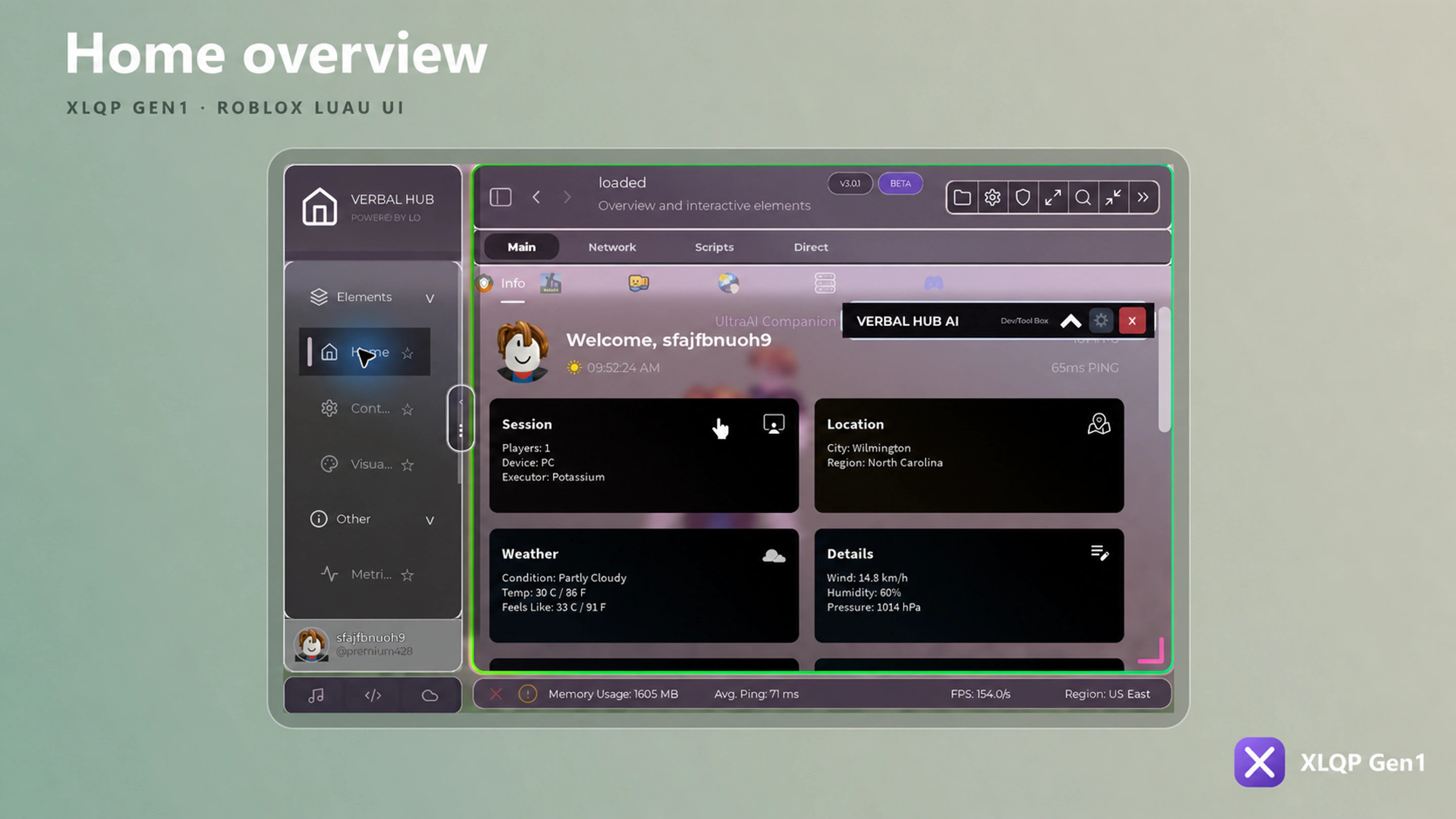
Interface preview
Start here
Set up the library, create your first window, then explore the element guides. Every code sample is designed to be copied and adapted.
Build your first interface
getgenv().XLQP_SECURE = true

local Library = loadstring(game:HttpGet("https://raw.githubusercontent.com/josediaz765/XLQP-UIS/main/xlqp%20gen1"))()

local Window = Library:MakeWindow({
    Branding = {
        Name = "My Hub",
        Subtitle = "Powered by XLQP Gen1",
    },
    Config = {
        Enabled = true,
        Folder = "MyHub",
    },
    Behavior = {
        ToggleKey = Enum.KeyCode.RightShift,
    },
})

local MainTab = Window:MakeTab({
    Name = "Main",
    Icon = "home",
})

local General = MainTab:AddSection({ Name = "General" })

General:AddToggle({
    Name = "Enabled",
    Default = false,
    Callback = function(value)
        print("Enabled:", value)
    end,
})
Explore the docs
| Guide | What you will learn |
|---|---|
| Installation | Load XLQP safely and create a minimal project |
| Secure Mode | Learn exactly what protected asset handling and Anti Logger do—and do not do |
| Window configuration | Brand, theme, resize, load, secure, and persist your UI |
| Navigation | Create tabs, sections, tab boxes, and side menus |
| Input elements | Buttons, toggles, sliders, dropdowns, binds, and text inputs |
| Content elements | Labels, banners, notices, timelines, badges, and cards |
| Data elements | Tables, charts, progress, monitors, and live displays |
| Media elements | Images, video, audio, drawing, and 3D viewports |
| Advanced elements | Sessions, plugins, chat, tools, AI, and executors |
| Every element | Every public element has its own page with Example and Options tabs |
| Element options | Every optional constructor field in one searchable reference |
| All elements | Searchable-at-a-glance method inventory |
Core pattern
Every XLQP interface follows the same hierarchy:
Library
└── Window
    ├── Tab
    │   ├── Section
    │   │   └── Element
    │   └── Tabbox
    │       └── Tab
    └── Sidebar menu / panel
Most element constructors accept a configuration table and return a controller. Keep that controller when you need to update the element later.
local Speed = General:AddSlider({
    Name = "Walk speed",
    Min = 16,
    Max = 100,
    Default = 16,
    Increment = 1,
    Callback = function(value)
        print(value)
    end,
})

Speed:Set(32)
Next step
Continue to Installation, or jump straight to the complete element index.