Input elements
Buttons, toggles, sliders, dropdowns, binds, text fields, color pickers, and other controls.
Input elements
Input elements collect user choices and call your Callback. Add them to a section, tab-box tab, panel group, or any compatible XLQP container.
Interface previews
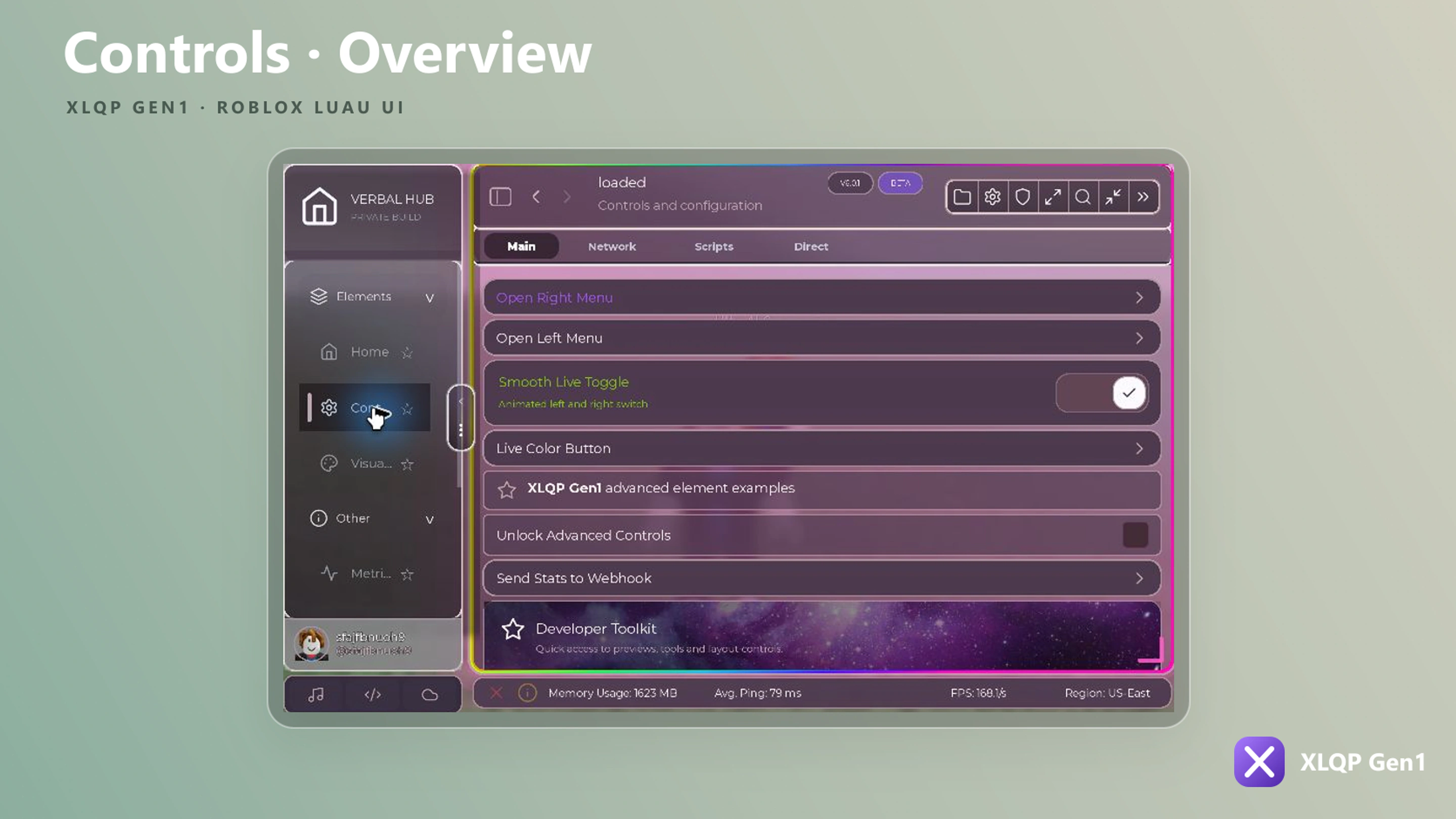
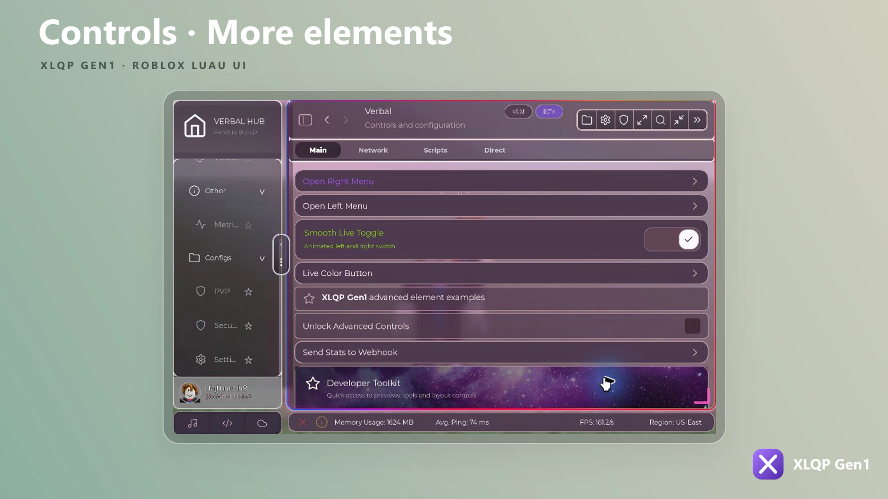
Toggle
local Toggle = Section:AddToggle({
    Name = "Auto collect",
    Default = false,
    Callback = function(value)
        print("Auto collect:", value)
    end,
})
AddToggle supports Name, Description/Content, Default, Flag, Save, Color, Locked, Checkbox, Binded, DefaultBind, Settings, icons, and Callback. Its controller can Set, SetName, SetBind, and open settings. It can also attach action rows, dropdowns, mini-buttons, or sliders.
Button
local Button = Section:AddButton({
    Name = "Run action",
    Icon = "play",
    Callback = function()
        print("Action started")
    end,
})

Button:Press()
Button:SetLocked(false)
Use AddCooldownButton when an action must wait before it can be triggered again.
local Cooldown = Section:AddCooldownButton({
    Name = "Redeem reward",
    Description = "Available every 30 seconds.",
    ButtonText = "Redeem",
    CooldownText = "Wait…",
    Duration = 30,
    Callback = function()
        print("Redeemed")
    end,
})
Its controller provides Start, Cancel, SetDuration, IsCoolingDown, and Trigger.
Slider
local Speed = Section:AddSlider({
    Name = "Walk speed",
    Description = "Choose a value from 16 to 100.",
    Min = 16,
    Max = 100,
    Default = 16,
    Increment = 1,
    ValueName = " studs/s",
    Smooth = true,
    Flag = "walk_speed",
    Save = true,
    Callback = function(value)
        print(value)
    end,
})

Speed:Set(32)
Optional formatting hooks include FormatValue, ParseValue, and DisplayFormattedInput. Use Color and Color2 for the track gradient.
Dropdown
local Mode = Section:AddDropdown({
    Name = "Target mode",
    Options = { "Closest", "Lowest health", "Random" },
    Default = "Closest",
    Search = true,
    MultiSelect = false,
    Flag = "target_mode",
    Save = true,
    Callback = function(value)
        print("Selected:", value)
    end,
})
Useful options include Options, Default, MultiSelect, Search, Players, Whitelist, Advanced, Fill, FillColor, Outline, OutlineColor, Locked, Flag, and Save.
Mode:SelectAll()
Mode:Invert()
Mode:Clear()
Mode:Refresh({ "Closest", "Farthest" })
Textbox and text area
Section:AddTextbox({
    Name = "Display name",
    Placeholder = "Type a name…",
    Default = "Player",
    Flag = "display_name",
    Save = true,
    Callback = function(text)
        print(text)
    end,
})
Bind
local Bind = Section:AddBind({
    Name = "Open menu",
    Default = Enum.KeyCode.RightShift,
    Hold = false,
    Flag = "menu_bind",
    Save = true,
    Callback = function(active)
        print(active)
    end,
})

Bind:Set(Enum.KeyCode.F4)
Color picker
local Accent = Section:AddColorpicker({
    Name = "Accent color",
    Default = Color3.fromRGB(139, 92, 246),
    Transparency = 0,
    Live = true,
    Flag = "accent_color",
    Save = true,
    Callback = function(color, transparency)
        print(color, transparency)
    end,
})

Accent:Set(Color3.fromRGB(59, 130, 246))
Accent:SetTransparency(0.15)
Compact controls
| Method | Purpose | Main options |
|---|---|---|
AddStepper | Increment/decrement a number | Min, Max, Default, Increment, Callback |
AddChecklist | Toggle a list of items | Items, Callback |
AddQuickToggleRow | Compact set of boolean options | Options, Default, Callback |
CreateCheckbox | Standalone checkbox control | CurrentValue, Flag, Save, Callback |
AddActionRow | Row of action buttons | Buttons, Outline, OutlineColor |
AddMiniButtons | Small inline buttons | Buttons |
CreateFlipButton | Two-sided action button | Front, Back, Callback |
CreateRippleButton | Animated button | Name, Description, Callback |
See Controllers for runtime update methods.