Window configuration
Complete MakeWindow example and every optional window configuration group used by XLQP Gen1.
Window configuration
Library:MakeWindow() accepts one configuration table. Every group and field is optional, so start with the minimal version or copy the complete configuration and remove what you do not need.
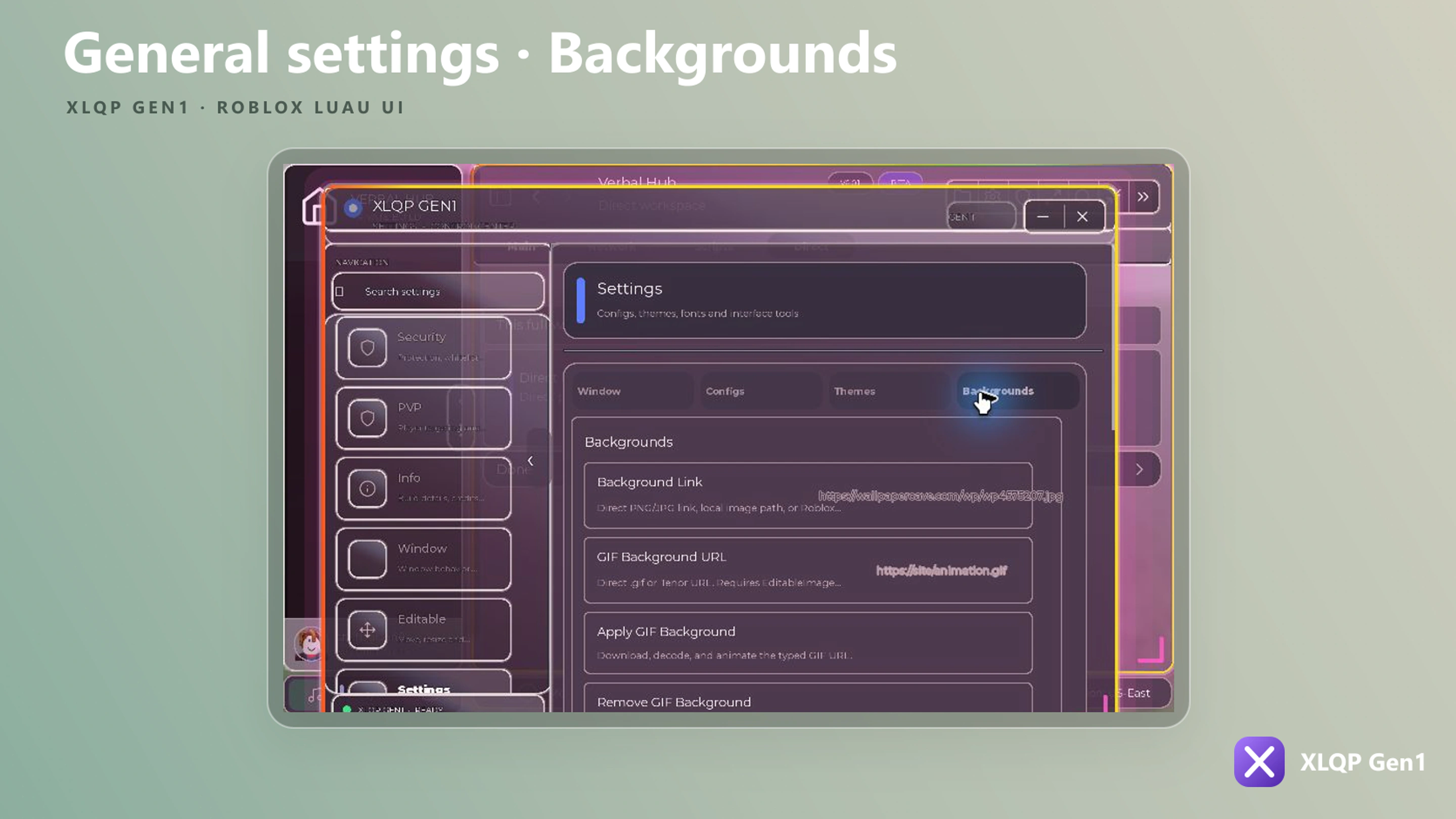
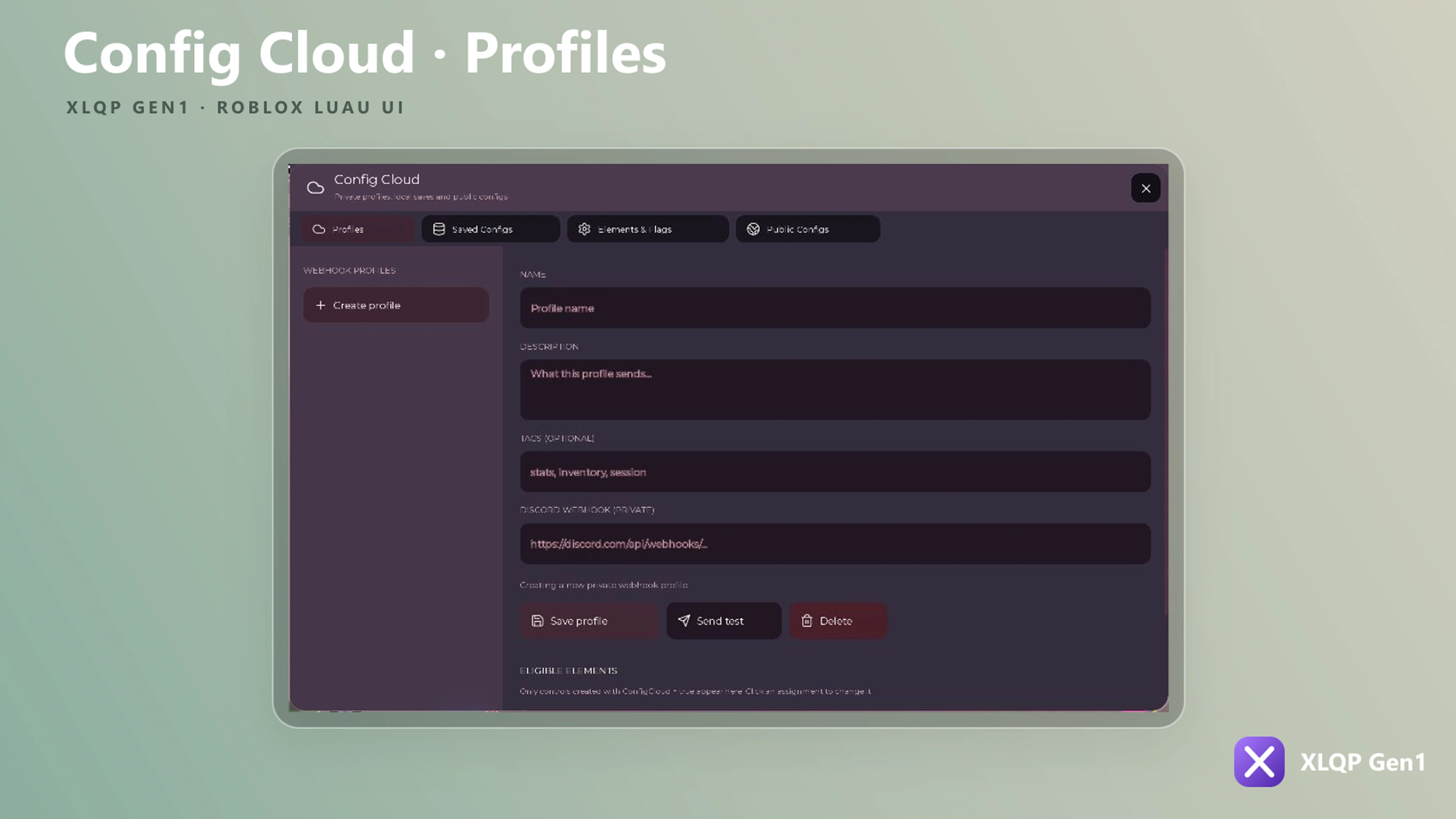
Window and settings previews
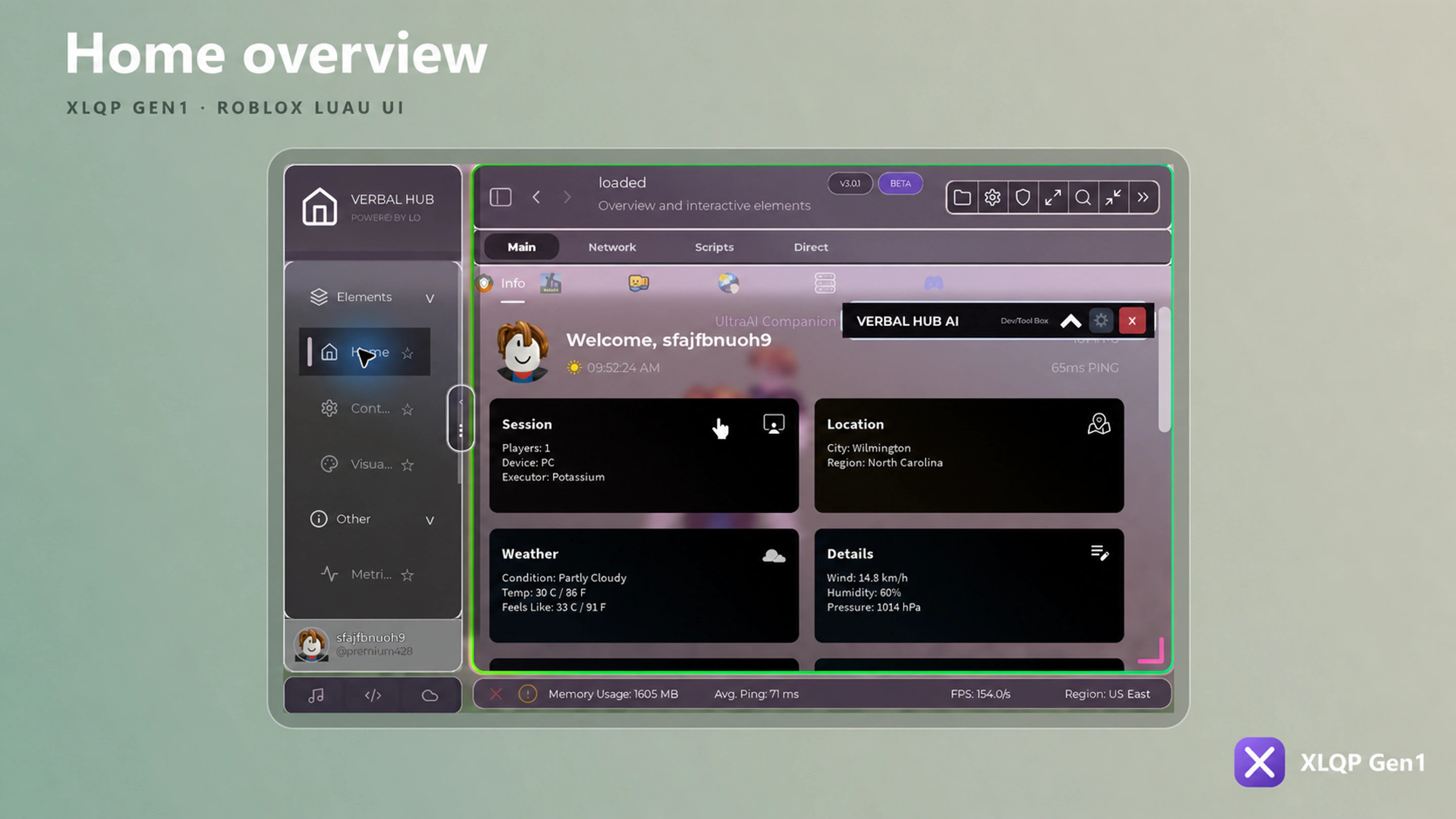
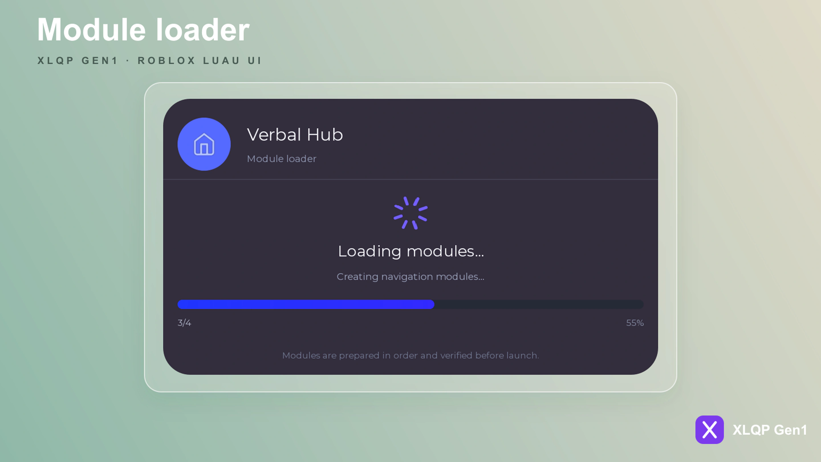
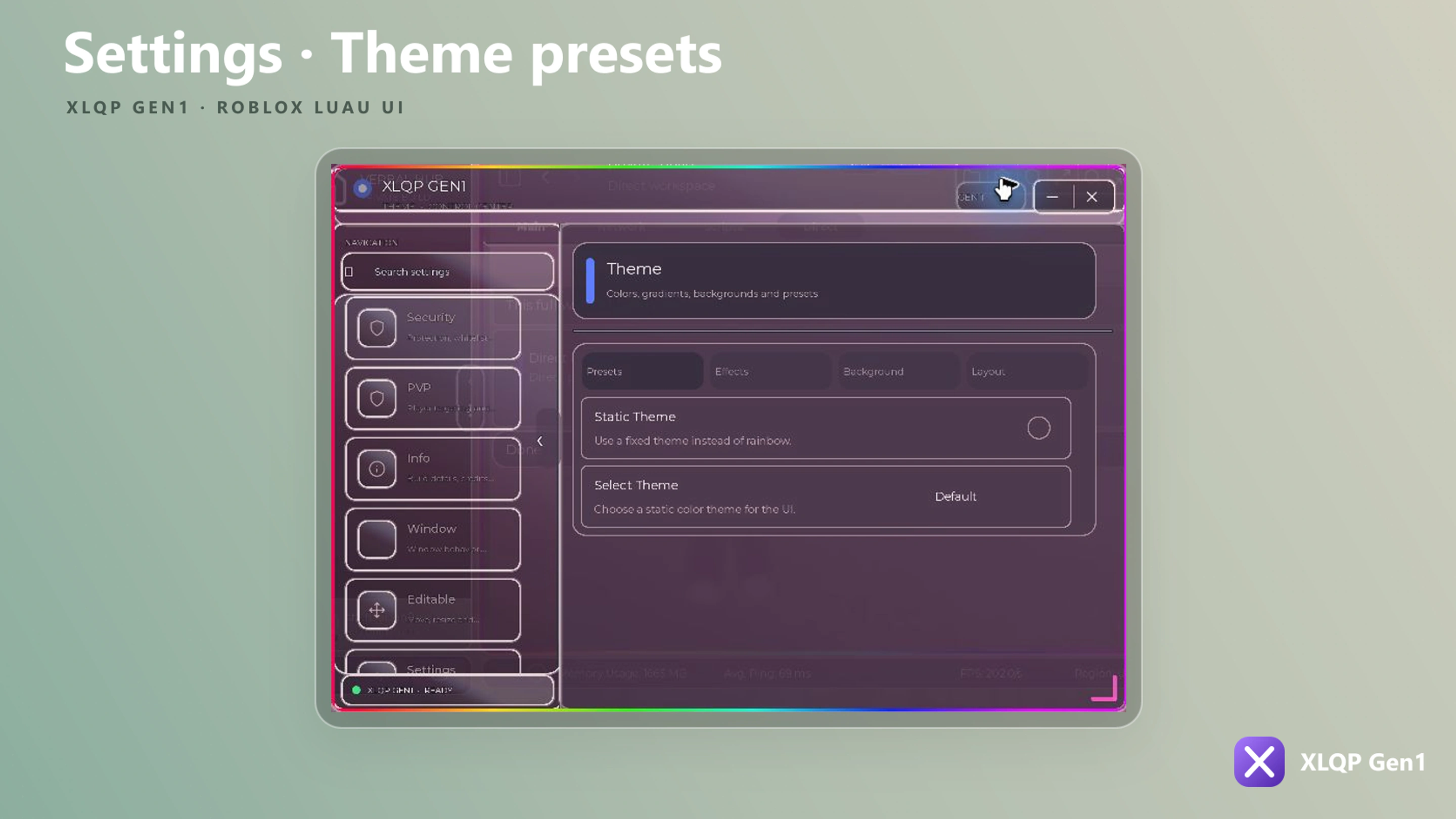
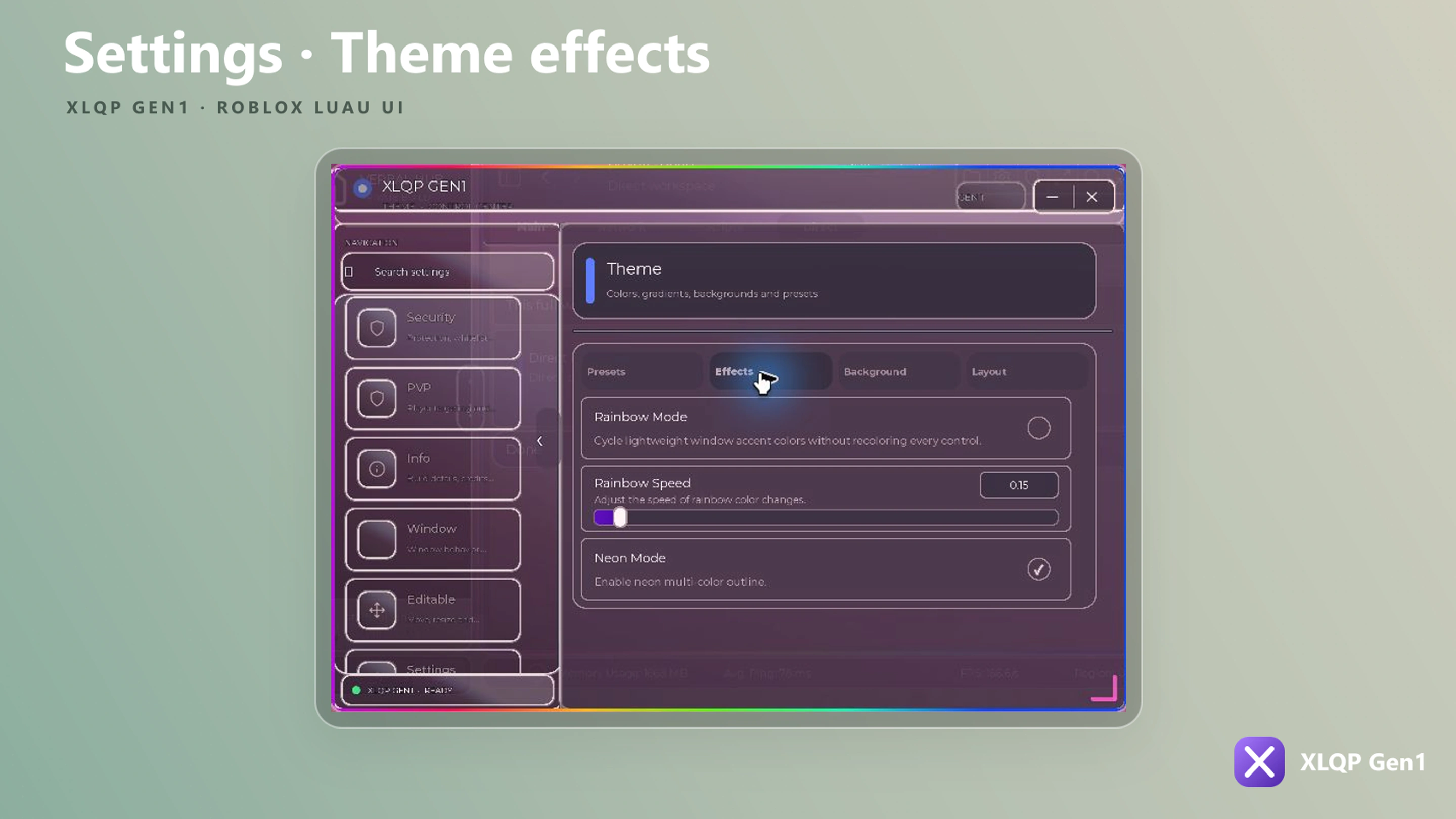
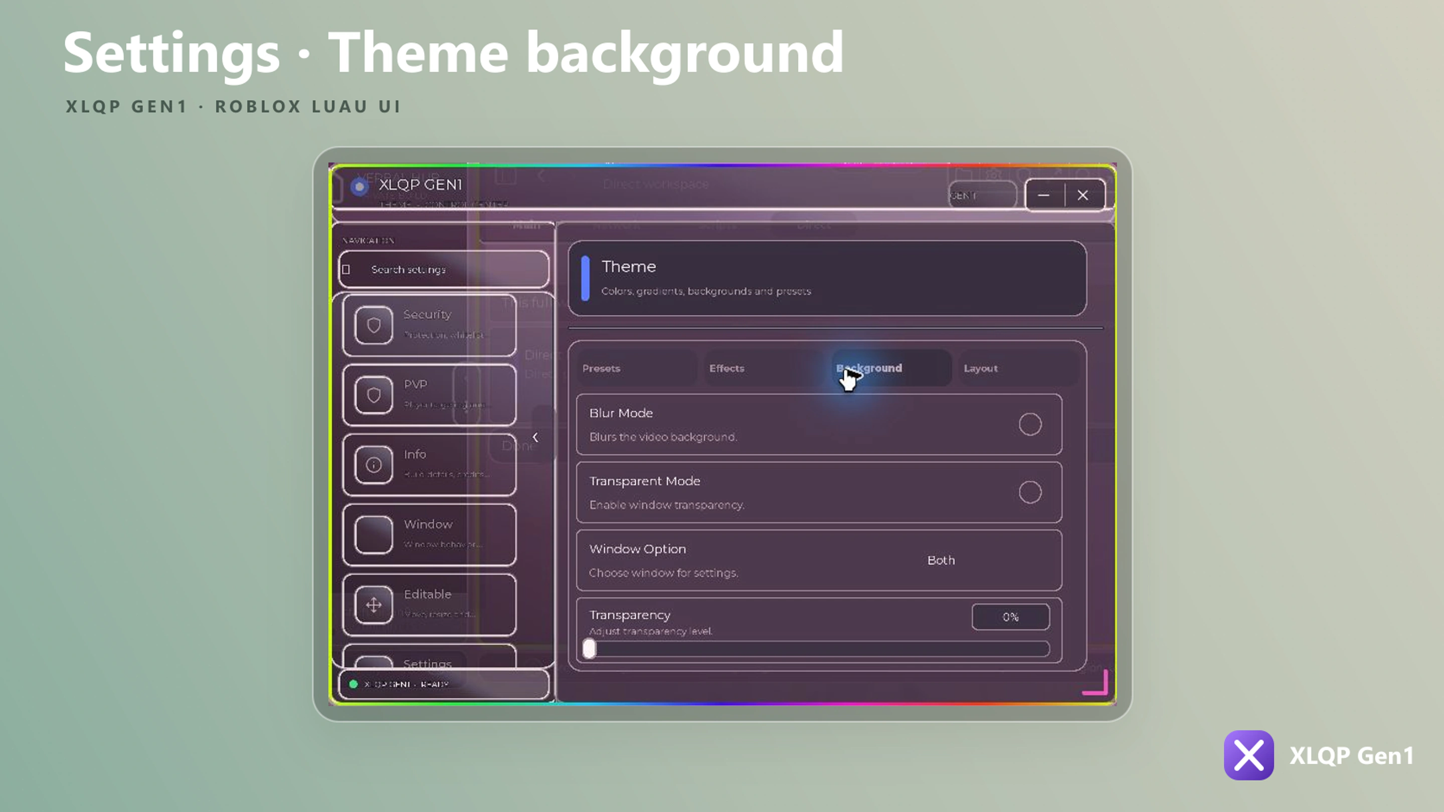
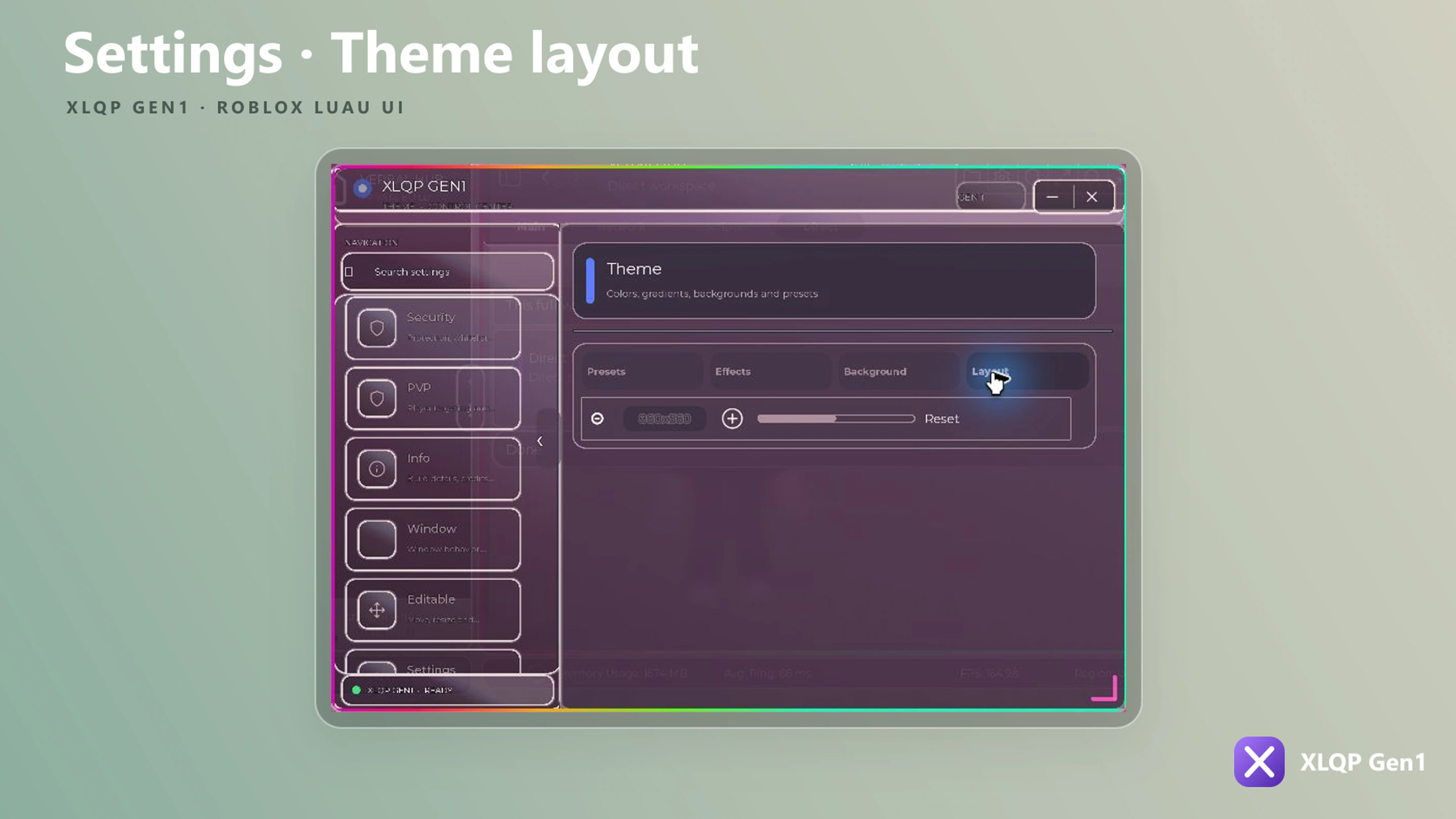
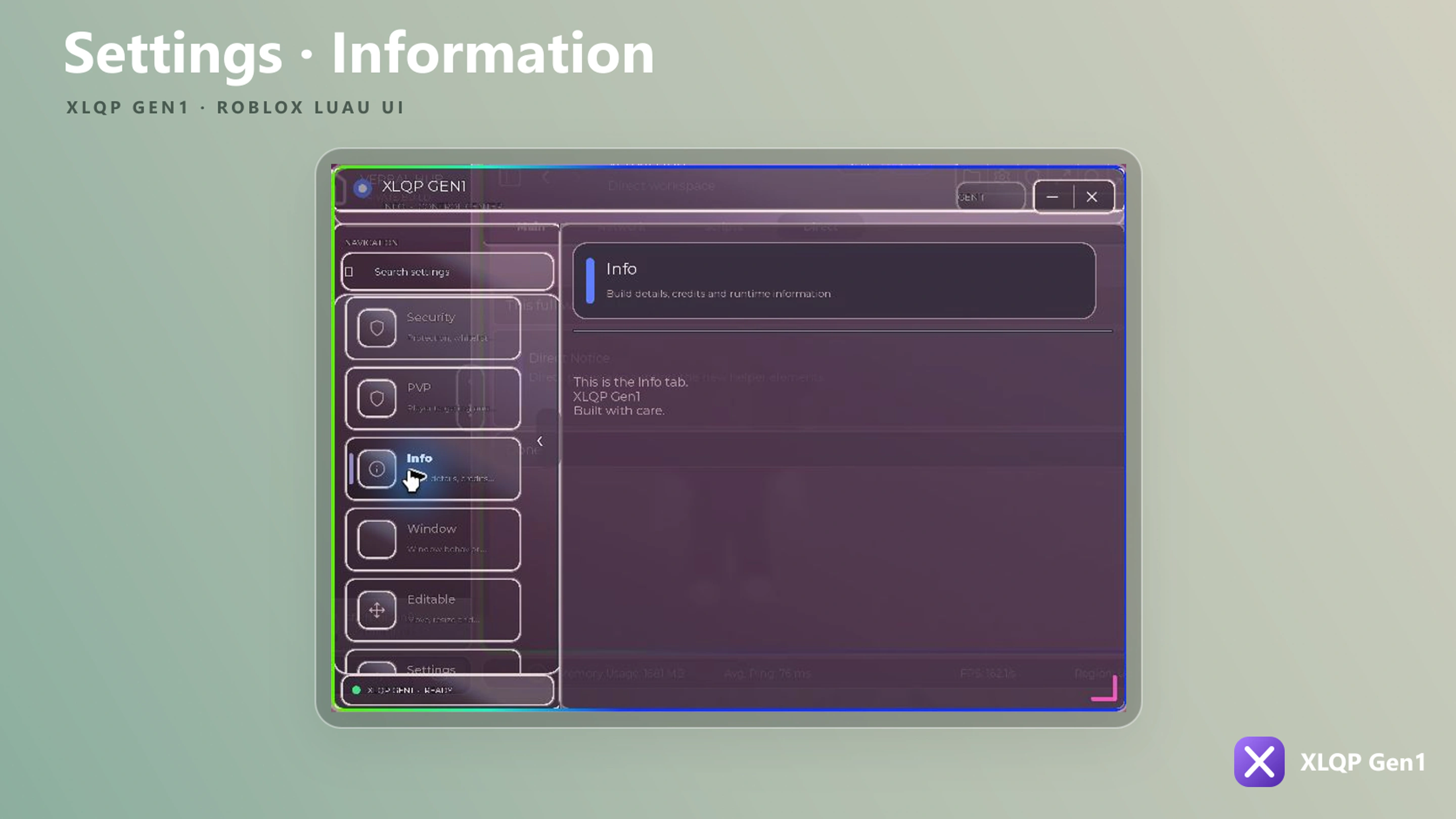
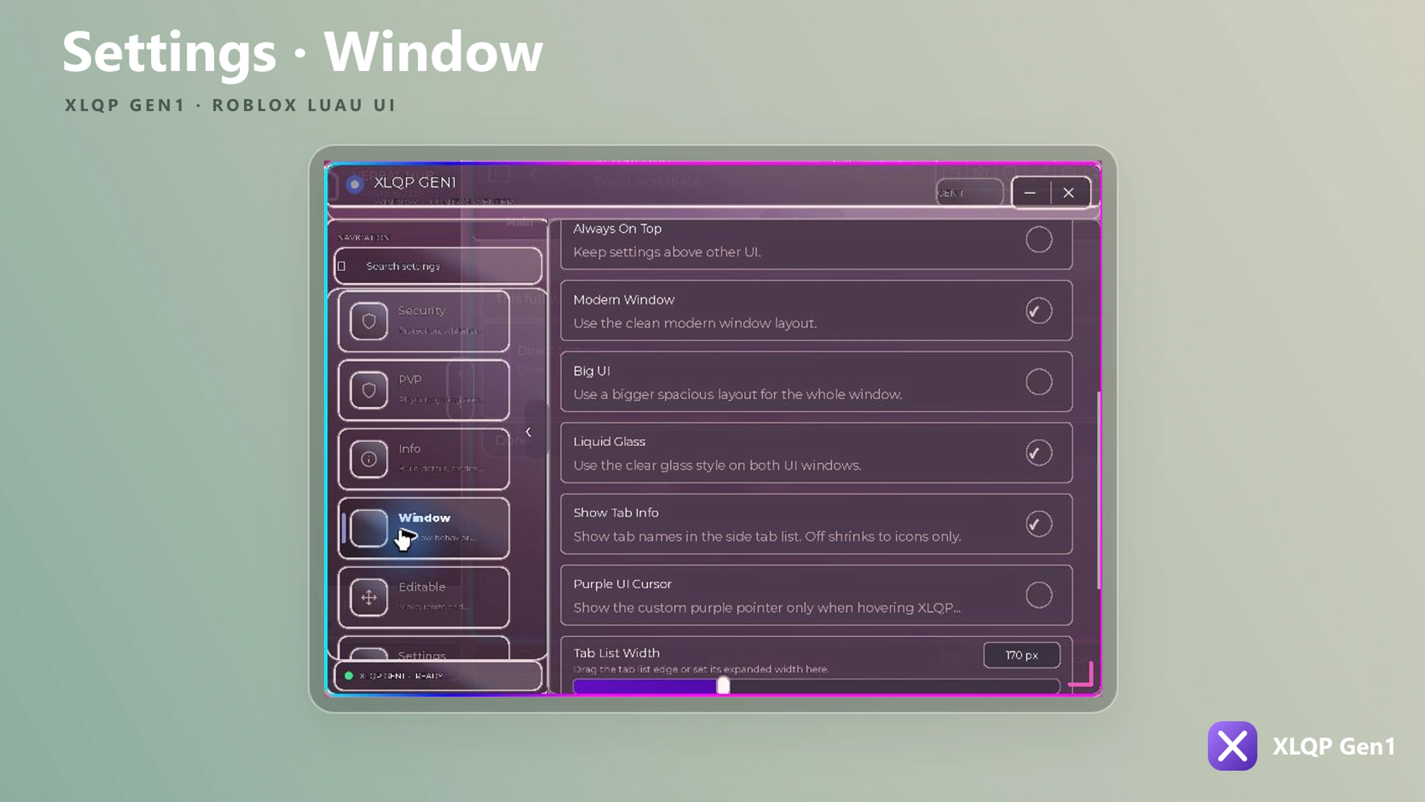
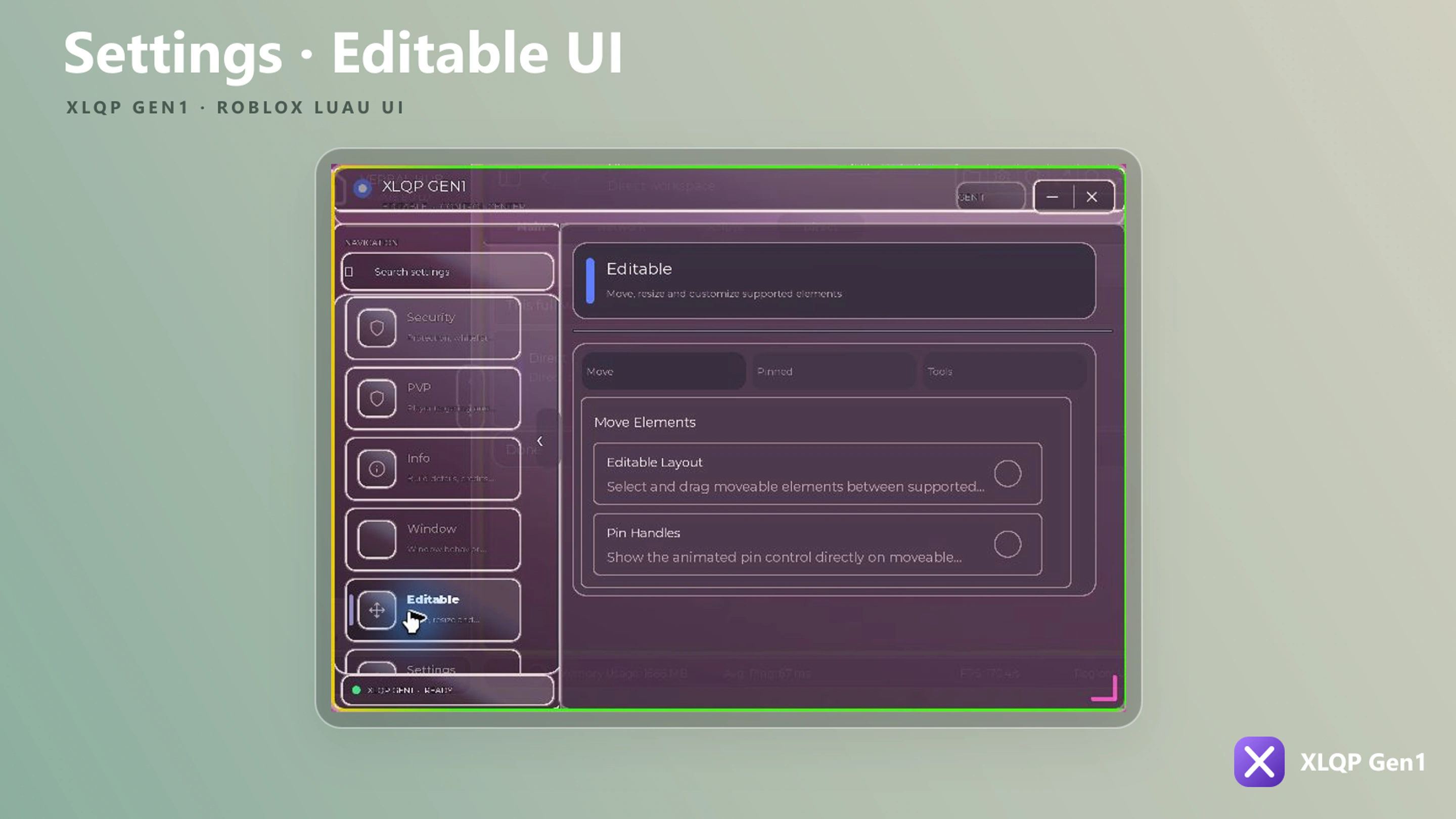
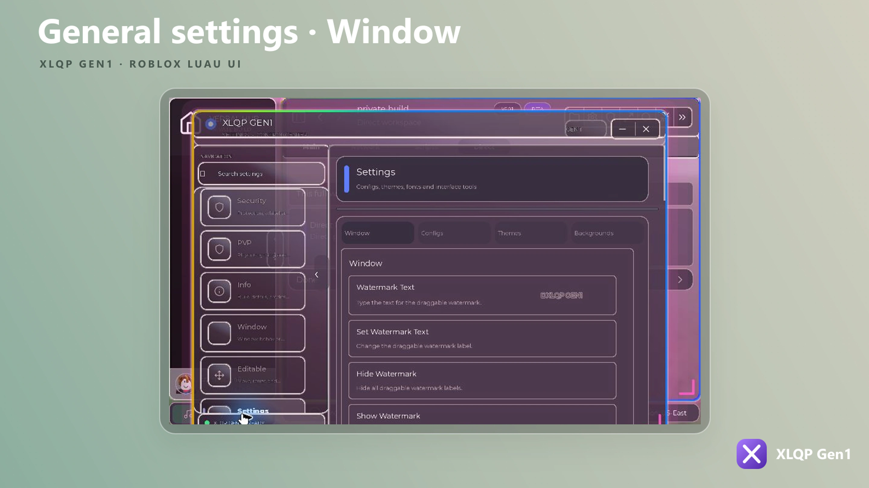
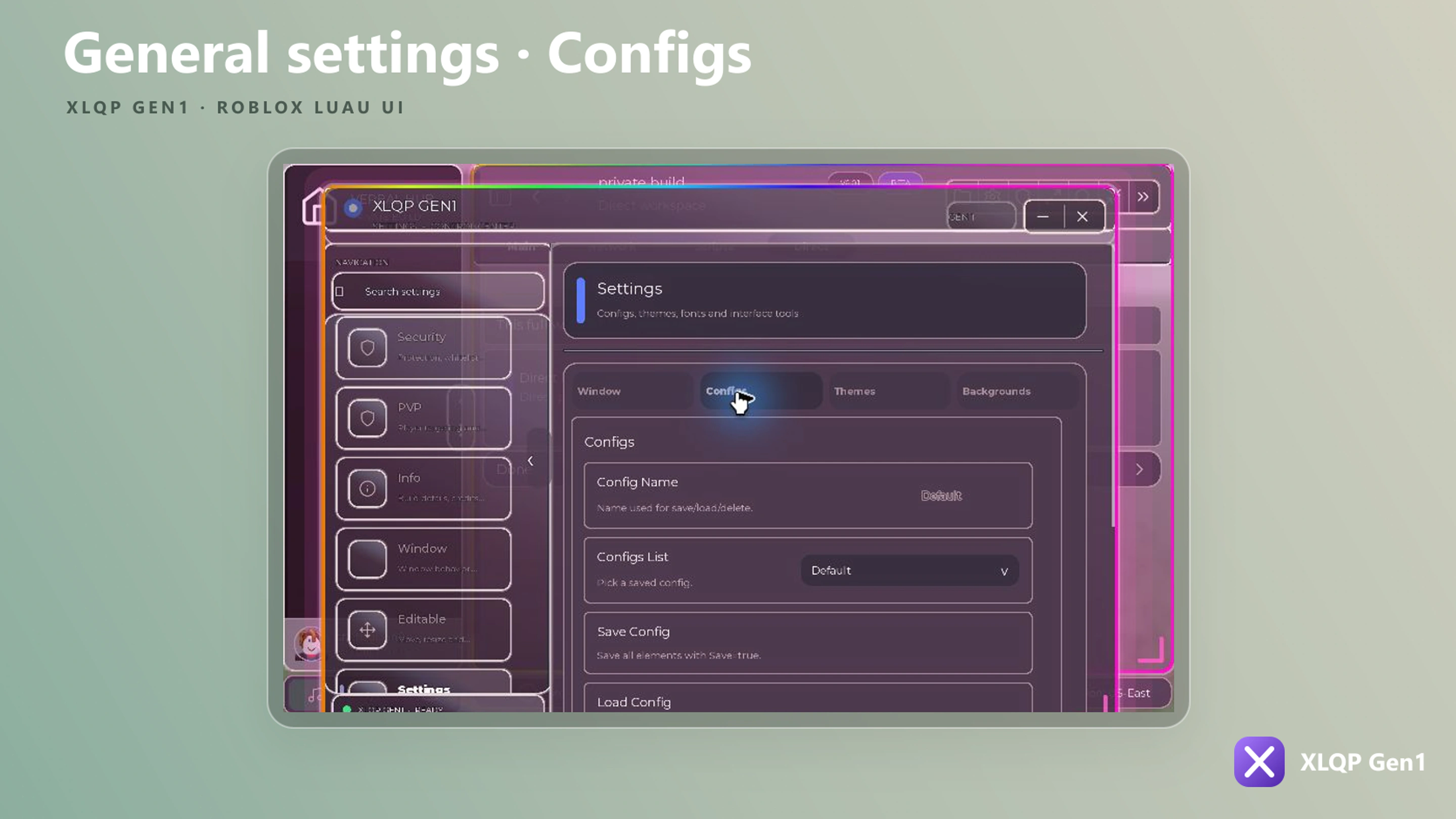
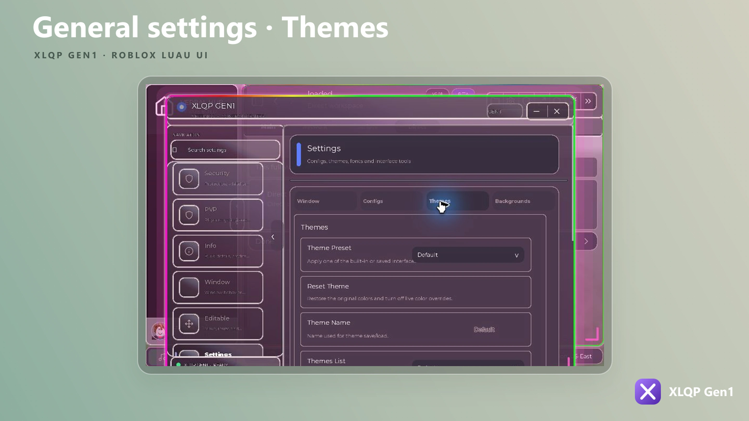
local Window = Library:MakeWindow({
    Branding = {
        Name = "My Hub",
        Subtitle = "XLQP Gen1",
        Icon = "home",
        IntroText = "My Hub",
        Tags = {
            { Text = "V1.0.0" },
            {
                Text = "BETA",
                BackgroundColor = Color3.fromRGB(116, 82, 190),
            },
        },
    },

    Config = {
        Enabled = true,
        Folder = "MyHub",
    },

    SaveUIPosition = true,
    SaveUISize = true,
    TabButtonsStyle = {
        Gap = 4,
        Padding = 8,
        CornerRadius = 6,
        Indicator = true,
        IndicatorWidth = 2,
        IndicatorHeight = 20,
    },

    PluginsEnabled = true,
    PluginsFolder = "MyHub/plugins",
    PrebuiltPlugins = {},

    TopBarQuickPanels = {
        Enabled = true,
        Toggles = true,
        Notifications = true,
        TogglesTitle = "Active Toggles",
        NotificationsTitle = "Notifications",
        ToggleIcon = "list-checks",
        NotificationIcon = "bell",
        NotificationLimit = 100,
        PanelWidth = 320,
        PanelHeight = 360,
        NotificationPanelWidth = 340,
        NotificationPanelHeight = 380,
        BadgeColor = Color3.fromRGB(93, 125, 255),
    },

    PrivateTabs = {
        Enabled = true,
        Password = "",
        TopName = "Private",
        TopIcon = "lock",
        EditorName = "Edit",
        EditorIcon = "pencil",
        EditorTitle = "Private Tab Editor",
        EditorSubtitle = "Create private tabs and elements.",
        EditorWidth = 900,
        EditorHeight = 560,
        DefaultName = "Custom Tab",
    },

    LoadingTitle = "Loading modules...",
    LoadingTasks = {
        "Creating navigation",
        "Loading themes and layout",
        "Building interface modules",
        "Finalizing interface",
    },

    GlowEnabled = true,
    GlowSpeed = 6,
    GlowColor = Color3.fromRGB(139, 92, 246),

    betabuttonslist = true,
    Widgets = {
        Enabled = true,
        BetaButton = true,
        StartOpen = false,
        ButtonText = "Widgets",
        Icon = "layout-dashboard",
        Width = 1020,
        Height = 560,
        ScreenPadding = 32,
        CornerRadius = 18,
        DimBackground = false,
        BackgroundTransparency = 1,
        HideMainWindow = true,
        CloseOnOutside = false,
    },
    tablistspacing = 6,

    statusbar = {
        Region = "US-East",
    },

    uishadow = false,

    Appearance = {
        Shiny = true,
        NewUI = true,
        BigUI = false,
        LiquidGlass = true,
        AutoResizeText = false,
        CustomCursor = false,
        CornerRadius = 18,

        ResizeHandle = {
            Size = 42,
            Color = Color3.fromRGB(139, 92, 246),
        },

        ShowTabInfo = true,
        SidebarWidth = 170,
        SidebarCollapsedWidth = 76,

        LiveColor = true,
        LiveColorBackground = false,
        LiveColorThemeImages = true,
        LiveColorElementBackground = false,
        LiveColorElements = true,
        LiveColorTheme = "Custom Galaxy Rain",
        LiveColorFolder = "XLQPGen1/LiveColors",
        LiveColorScriptsEnabled = true,
        LiveColorSpeed = 0.22,
        RainbowUpdateRate = 20,
        LiveColorSettingsBackground = true,
        LiveColorTransparency = 0.04,

        BackgroundEnabled = true,
        BackgroundImage = "rbxassetid://0",
        BackgroundTransparency = 0.2,
        BackgroundScaleType = "Crop",

        GifBackgroundEnabled = false,
        GifBackgroundUrl = "",
        GifBackgroundTransparency = 0.2,
        Size = UDim2.new(0, 860, 0, 560),
    },

    Loading = {
        IntroEnabled = true,
        IntroText = "My Hub",
        IntroSubtitle = "Loading...",
        IntroAccentColor = Color3.fromRGB(139, 92, 246),
        IntroDuration = 0.8,
        LoadingProgress = true,
        FastLoad = true,
        AutoInit = false,
        Delay = 2.5,
        PerformanceMode = true,
    },

    Setup = {
        Enabled = true,
        Version = 1,
        RequireVersionMatch = false,
        OwnerOnly = false,
        Folder = "MyHub",
        FileName = "first_run_setup",
        Name = "My Hub",
        Title = "My Hub",
        AccentColor = Color3.fromRGB(139, 92, 246),
        DefaultLanguage = "en",
        DefaultLook = "Modern Dark",
        DefaultScale = 1,
        DefaultNewUI = true,
        DefaultLiquidGlass = true,
        Welcome = {
            Width = 560,
            Height = 280,
            Greeting = "Welcome,",
            ShowAvatar = true,
            ShowDisplayName = true,
            AvatarSize = 30,
            GreetingWidth = 82,
            NameSuffix = ".",
            PageNames = { "Welcome", "Language", "Appearance", "Interface Size", "Finish" },
            NextSuffix = " →",
            BackPrefix = "← ",
        },
    },

    UpdateLog = {
        Enabled = true,
        Folder = "MyHub",
        FileName = "update_log_seen",
        Title = "News!",
        Icon = "info",
        ButtonText = "Proceed",
        Logs = {
            {
                Id = "1.0.0-update-1",
                Title = "My Hub 1.0.0",
                Description = "Initial release.",
                Icon = "sparkles",
            },
        },
    },

    Behavior = {
        ToggleKey = "RightShift",
        UnlockMouse = true,
        Guide = false,
        AutoStartGuide = false,
        EditableAllElements = false,
    },

    Navigation = {
        Enabled = true,
        SidebarTab = true,
        TabList = {
            Detached = true,
            Width = 168,
            Gap = 12,
            CornerRadius = 14,
            Logo = {
                Image = "home",
                Text = "MY HUB",
                Subtitle = "XLQP GEN1",
                Layout = "Horizontal",
                Size = 40,
                Height = 78,
            },
        },
        Tabs = {
            { Name = "Home", Icon = "home" },
            { Name = "Security", Icon = "shield" },
            { Name = "Settings", Icon = "settings" },
        },
    },

    Typewriter = {
        Enabled = true,
        Multiple = true,
        Text = { "My Hub", "loaded", "ready" },
        Speed = 1.2,
        SoundDelay = 0.035,
        Sound = "rbxassetid://0",
        Pitch = 1,
    },

    Discord = {
        Enabled = false,
        Invite = "YOUR_INVITE_CODE",
        InviteUrl = "https://discord.gg/YOUR_INVITE_CODE",
        AuthEnabled = false,
        AutoStartAuth = false,
        PollInterval = 2.5,
        Timeout = 600,
        Whitelist = {},
    },

    YouTubeMusic = {
        APIKey = "",
        ConverterAPI = "https://yt-api.org",
        Folder = "MyHub/Music",
    },

    Spotify = {
        BridgeUrl = "",
        ConnectUrl = "",
    },

    Security = {
        AntiLogger = true,
        Mode = "Better",
        DiscordWebhookWhitelist = {
            "https://discord.com/api/webhooks/WEBHOOK_ID/WEBHOOK_TOKEN",
        },
    },

    BuiltInTabs = {
        Enabled = true,
        Group = "Configs",
        GroupIcon = "folder",
        Settings = {
            Enabled = true,
            WatermarkText = "MY HUB",
            AutoStartAuth = false,
        },
        Security = {
            Enabled = true,
        },
        PVP = {
            Enabled = false,
            Icon = "swords",
            Risky = true,
            RiskTitle = "Risky PVP tools",
            RiskDescription = "This tab can affect other players. Continue?",
            RiskTimeout = 5,
            RememberRisk = true,
            RiskDimBackground = false,
        },
    },

    Premium = {
        Enabled = false,
        Title = "Unlock Premium",
        Subtitle = "Enter a key to unlock premium controls.",
        FieldLabel = "License key",
        Placeholder = "MYHUB-XXXX-XXXX",
        ButtonText = "Activate",
        ButtonLabel = "Unlock Premium",
        Note = "Keys may be tied to one Roblox account.",
        GetKeyUrl = "https://example.com/get-key",
        Benefits = "Premium unlocks restricted controls.",
        Save = true,
        AutoRedeem = true,
        Validate = function(key, player)
            return key == "example", "Pro"
        end,
        Callback = function(unlocked, tier)
            print("premium", unlocked, tier)
        end,
    },

    KeySystem = {
        Enabled = false,
        Title = "My Hub Key",
        Description = "Enter your key to continue.",
        Key = { "XLQP-DEMO" },
        CaseSensitive = true,
        SaveKey = true,
        Folder = "MyHub",
        Theme = "Plant-Dark",
        URL = "https://xlqp.lol/",
    },

    SearchBar = {
        Default = "Search elements",
        ClearTextOnFocus = false,
        filter = true,
        StartOpen = true,
        MobileStartOpen = false,
        UnlockMouse = true,
        Shiny = true,
        DesktopBreakpoint = 860,
        HeaderRightReserve = 440,
        MaxHeaderWidth = 380,
        HeaderCenterScale = 0.46,
    },
})
Top-level options
These fields sit directly inside the MakeWindow table.
| Option | Type | Default / purpose |
|---|---|---|
Branding | table | Product name, subtitle, icon, intro text, and tags |
Config | table | Saved configuration settings |
SaveUIPosition | boolean | Restores the last window position |
SaveUISize | boolean | Restores the last window dimensions |
TabButtonsStyle | table | Gap, padding, corner radius, and selected-tab indicator |
PluginsEnabled | boolean | Enables the built-in plugin system |
PluginsFolder | string | Folder used to discover local plugins |
PrebuiltPlugins | table | Plugin definitions registered during startup |
TopBarQuickPanels | table | Active-toggle and notification panels in the top bar |
PrivateTabs | table | Private-tab editor names, icons, password, and dimensions |
Widgets | table | Floating widget dashboard behavior and dimensions |
Setup | table | First-run setup, defaults, and welcome-page layout |
UpdateLog | table | Versioned update cards shown once per release ID |
Premium | table | Optional premium key prompt and validator |
YouTubeMusic / Spotify | table | Optional media-service bridge configuration |
LoadingTitle | string | Main loading-stage label |
LoadingTasks | { string } | Ordered list shown by the loading controller |
GlowEnabled | boolean | Enables the ambient window glow |
GlowSpeed | number | Glow animation speed |
GlowColor | Color3 | Glow color |
betabuttonslist | boolean | Floating pill dock at the bottom of the screen |
tablistspacing | number | Pixels between sidebar tabs |
statusbar | boolean | table | Status bar across the bottom of the window |
uishadow | boolean | table | Drop shadow behind the windows |
Saved window geometry and tab buttons
SaveUIPosition and SaveUISize persist the user's window geometry. TabButtonsStyle accepts Gap, Padding, CornerRadius, Indicator, IndicatorWidth, and IndicatorHeight.
Window:SetTabButtonsStyle({ Gap = 6, Padding = 8, CornerRadius = 8 })
print(Window:GetTabButtonsStyle())
print(Window:GetTabButtonsStyleParameters())
TopBarQuickPanels
The quick-panel group accepts Enabled, Toggles, Notifications, TogglesTitle, NotificationsTitle, ToggleIcon, NotificationIcon, NotificationLimit, PanelWidth, PanelHeight, NotificationPanelWidth, NotificationPanelHeight, and BadgeColor.
Widgets
The widgets dashboard accepts Enabled, BetaButton, StartOpen, ButtonText, Icon, Width, Height, ScreenPadding, CornerRadius, DimBackground, BackgroundTransparency, HideMainWindow, and CloseOnOutside. Create cards with Window:AddWidget(config) after MakeWindow returns.
See New window and runtime APIs for widget controllers, dialogs, private tabs, admin tabs, media center, dynamic-island notifications, and parameter introspection.
Beta buttons list
Set betabuttonslist = true to show a floating dock at the bottom of the screen. It lives in its
own ScreenGui, so it stays visible whether the interface is open or closed.
The dock has a launcher button, a nav pill (home, AI, search), a tools pill (plugins, media), a user pill (settings, avatar), a collapse arrow, and a clock pill on the far right.
While it is enabled the vertical closed-tab list is suppressed, and a disc player anchored to the bottom of the screen is lifted above the dock automatically.
Library:SetBetaButtonsList(true)

if Library:IsBetaButtonsListEnabled() then
    print("dock is on")
end
A Beta Buttons List toggle is also added to the built-in Settings tab, saved under the
XLQPBetaButtonsList flag.
Status bar
statusbar draws a bar across the bottom of the main window with error and warning indicators
followed by live memory, ping, FPS, and region readouts. Pass true for defaults or a table to
configure it.
| Option | Type | Description |
|---|---|---|
Region | string | Text shown in the Region: readout. Defaults to N/A |
The error and warning icons brighten when the library has recorded an error, and clicking either one raises a notification with the details.
Library:SetStatusBar(true)UI shadow
uishadow adds a soft drop shadow behind the main window, the settings window, and the detached
tab list. It is off by default. Pass true for defaults or a table to configure it.
| Option | Type | Description |
|---|---|---|
Spread | number | How far the shadow extends past the frame. Default 18, clamped to 4–90 |
Transparency | number | 0–1. Default 0.62 |
Color | Color3 | Shadow color. Default black |
OffsetX | number | Horizontal offset in pixels. Default 0 |
OffsetY | number | Vertical offset in pixels. Default 6 |
Library:SetUIShadow(true, { Spread = 18, Transparency = 0.62 })

Library:ApplyUIShadow(someFrame, { Spread = 12 })
Library:RemoveUIShadow(someFrame)
The shadow is created as a sibling of its target rather than a child, so a frame with
ClipsDescendants cannot cut it off. It tracks the target's position, size, anchor point,
visibility, and ZIndex, and destroys itself when the target leaves the tree.
ApplyUIShadow accepts any GuiObject, so it can be used on your own elements. It replaces any
shadow already applied to that frame.
Branding
| Option | Type | Description |
|---|---|---|
Name | string | Main window/product name |
Subtitle | string | Supporting brand text |
Icon | string | Icon name, asset ID, or supported image value |
IntroText | string | Branding text used by the intro |
Tags | table | List of strings or { Text, BackgroundColor } tag objects |
Config
| Option | Type | Description |
|---|---|---|
Enabled | boolean | Enables saved control state |
Folder | string | Stable folder used for configuration files |
For an element to persist, give it a unique Flag and set Save = true.
Appearance
Layout and surface
| Option | Type | Description |
|---|---|---|
Shiny | boolean | Enables shine effects |
NewUI | boolean | Enables the newer XLQP layout |
BigUI | boolean | Uses the larger layout preset |
LiquidGlass | boolean | Enables glass-like window surfaces |
AutoResizeText | boolean | Resizes text to available space |
CustomCursor | boolean | Enables the custom XLQP cursor |
CornerRadius | number | Shared surface radius |
ResizeHandle | table | Resize handle { Size, Color } |
ShowTabInfo | boolean | Shows tab metadata where supported |
SidebarWidth | number | Expanded sidebar width |
SidebarCollapsedWidth | number | Collapsed sidebar width |
Size | UDim2 | Initial window dimensions |
Live color
| Option | Type | Description |
|---|---|---|
LiveColor | boolean | Enables live-color processing |
LiveColorBackground | boolean | Applies live color to the main background |
LiveColorThemeImages | boolean | Applies live color to theme images |
LiveColorElementBackground | boolean | Applies live color to element backgrounds |
LiveColorElements | boolean | Enables live colors on supported elements |
LiveColorTheme | string | Selected live-color theme name |
LiveColorFolder | string | Folder containing live-color scripts/themes |
LiveColorScriptsEnabled | boolean | Enables live-color script discovery |
LiveColorSpeed | number | Animation speed |
RainbowUpdateRate | number | Rainbow refresh frequency |
LiveColorSettingsBackground | boolean | Applies live color behind settings |
LiveColorTransparency | number | Live-color overlay transparency |
Background
| Option | Type | Description |
|---|---|---|
BackgroundEnabled | boolean | Enables a custom image background |
BackgroundImage | string | Roblox asset ID or supported image URL |
BackgroundTransparency | number | Transparency from 0 to 1 |
BackgroundScaleType | string / Enum.ScaleType | Image scaling mode such as Crop |
GifBackgroundEnabled | boolean | Loads the configured animated GIF background when the window starts |
GifBackgroundUrl | string | Direct GIF or Tenor page URL; leave empty when disabled |
GifBackgroundTransparency | number | Animated background transparency from 0 to 1; defaults to the static background transparency or 0.18 |
Animated GIF backgrounds
Set the three GIF fields inside Appearance. This example intentionally uses a placeholder rather than publishing a real media link.
Appearance = {
    GifBackgroundEnabled = true,
    GifBackgroundUrl = "YOUR_GIF_OR_TENOR_URL",
    GifBackgroundTransparency = 0.2,
}
XLQP accepts a direct GIF file or a Tenor page that resolves to GIF media. Animated backgrounds require an executor with buffer support, Content.fromObject, and EditableImage. The current runtime rejects GIFs larger than 1024 × 1024, files with more than 240 frames, or animations whose total frame pixels exceed 24,000,000.
Check support before changing the background at runtime:
local Supported, Reason = Window:IsGifBackgroundSupported()

if Supported then
    Window:SetGifBackground("YOUR_GIF_OR_TENOR_URL", 0.2)
else
    warn("GIF backgrounds are unavailable: " .. Reason)
end

-- Stop the animation and restore the configured static background.
Window:RemoveGifBackground()
SetGifBackground(url, transparency) begins loading asynchronously and returns the Window controller. If downloading, decoding, or displaying the GIF fails, XLQP disables the animation and restores the static background when one is configured.
Loading
| Option | Type | Description |
|---|---|---|
IntroEnabled | boolean | Shows the intro before the main window |
IntroText | string | Intro title |
IntroSubtitle | string | Intro supporting text |
IntroAccentColor | Color3 | Intro accent color |
IntroDuration | number | Intro animation duration |
LoadingProgress | boolean | Shows loading progress/tasks |
FastLoad | boolean | Shortens nonessential loading animation |
AutoInit | boolean | Initializes automatically |
Delay | number | Startup delay in seconds |
PerformanceMode | boolean | Reduces visual work for slower devices |
When AutoInit = false, update and close the loading controller yourself.
local Loading = Library:GetLoading()
Loading:SetStage("Loading modules...")
Loading:SetTask(1, "Creating navigation...", 0.5)
Loading:NextTask()
Loading:Close()
GetLoading() never returns nil. When no loading screen is active — because LoadingProgress is off, or the screen has already closed — it returns an idle controller whose SetStep, SetStage, SetTitle, SetSubtitle, SetProgress, SetTasks, SetTask, NextTask, CompleteTask, ShowIntro, Close, and Destroy methods accept the same arguments and do nothing. Call it right after MakeWindow and use the result unguarded; a fallback table of empty functions is not needed.
Setup and update log
Setup configures the first-run wizard. Its main fields are Enabled, Version, RequireVersionMatch, OwnerOnly, Folder, FileName, Name, Title, AccentColor, DefaultLanguage, DefaultLook, DefaultScale, DefaultNewUI, and DefaultLiquidGlass.
Setup.Welcome accepts Width, Height, Greeting, ShowAvatar, ShowDisplayName, AvatarSize, GreetingWidth, NameSuffix, PageNames, NextSuffix, and BackPrefix.
UpdateLog accepts Enabled, Folder, FileName, Title, Icon, FontColor, DescriptionColor, ButtonText, and Logs. Each log supports Id, Title, Description, Icon or Image, FontColor, and DescriptionColor.
Behavior
| Option | Type | Description |
|---|---|---|
ToggleKey | string / Enum.KeyCode | Shows or hides the interface |
UnlockMouse | boolean | Releases the cursor while XLQP is open |
Guide | boolean / table | Enables or configures onboarding |
AutoStartGuide | boolean | Starts the guide automatically |
EditableAllElements | boolean | Enables editing/moving supported elements |
Navigation
| Option | Type | Description |
|---|---|---|
Enabled | boolean | Enables generated navigation |
SidebarTab | boolean | Uses the sidebar tab layout |
TabList | table | Detached tab-list configuration |
Tabs | table | Initial { Name, Icon } tab definitions |
Spacing between sidebar tabs is controlled by the top-level tablistspacing option.
TabList
| Option | Type | Description |
|---|---|---|
Detached | boolean | Shows the tab list as a detached surface |
Width | number | List width |
Gap | number | Space between the list and window |
CornerRadius | number | Detached surface radius |
Logo | table | Logo { Image, Text, Subtitle, Layout, Size, Height } |
Typewriter
| Option | Type | Description |
|---|---|---|
Enabled | boolean | Enables the typewriter text |
Multiple | boolean | Cycles through a list of strings |
Text | string / { string } | One message or multiple rotating messages |
Speed | number | Text animation speed |
SoundDelay | number | Delay between typing sounds |
Sound | string | Typing sound asset |
Pitch | number | Typing sound pitch |
Discord
| Option | Type | Description |
|---|---|---|
Enabled | boolean | Enables Discord integration |
Invite | string | Invite code |
InviteUrl | string | Full invite URL |
AuthEnabled | boolean | Enables Discord authentication |
AutoStartAuth | boolean | Starts authentication with the window |
PollInterval | number | Authentication polling interval |
Timeout | number | Authentication timeout |
Whitelist | { string } | Allowed invite/Discord destinations |
MakeWindow restores any saved Discord auth profile itself, so scripts do not call LoadDiscordAuthProfile. The method is created while the window is built, which means calling it on Library before MakeWindow fails with attempt to call missing method 'LoadDiscordAuthProfile' of table. Read the restored profile from Library.DiscordAuthProfile or getgenv().XLQPDiscordAuth after the window exists.
Media services
YouTubeMusic accepts APIKey, ConverterAPI, and Folder. Spotify accepts BridgeUrl and ConnectUrl. Leave provider credentials and bridge URLs empty when those integrations are not configured.
Security
| Option | Type | Description |
|---|---|---|
AntiLogger | boolean | Enables URL/logger protection |
Mode | string | Security policy such as Better |
DiscordWebhookWhitelist | { string } | Explicitly allowed webhook URL patterns |
This window group configures Anti Logger; it does not enable the early-load XLQP_SECURE asset policy. See Secure Mode for the exact difference, supported runtime functions, and fail-closed behavior.
Do not publish secrets
Keep private loader tokens, real webhook URLs, API keys, authentication hashes, and private keys out of public scripts and documentation.
BuiltInTabs
| Option | Type | Description |
|---|---|---|
Enabled | boolean | Enables XLQP built-in pages |
Group | string | Navigation group label |
GroupIcon | string | Navigation group icon |
Settings | table | Settings-tab configuration |
Security | table | Security-tab configuration |
PVP | table | PVP-tab configuration and risk prompt |
Settings accepts Enabled, WatermarkText, and AutoStartAuth. Security accepts Enabled. PVP accepts Enabled, Icon, Risky, RiskTitle, RiskDescription, RiskTimeout, RememberRisk, and RiskDimBackground.
Mute Global Sounds
Mute Global Sounds silences the game's audio while leaving every sound XLQP owns audible. It appears in two places, and both stay in sync: the built-in Settings tab, where it saves under the XLQPMuteGlobalSounds flag, and Quick Controls on the settings GUI overview page.
Turning it on stores each sound's current volume, sets it to 0, and watches for new audio; turning it off restores the stored volumes. If the game changes a muted sound's volume while the toggle is on, XLQP re-zeroes it and restores that newer value on unmute.
| Method | What it does |
|---|---|
Library:SetGlobalSoundsMuted(state) | Mutes or restores game audio and returns the resulting state |
Library:GetGlobalSoundsMuted() | Returns true while game audio is muted |
Library:ToggleGlobalSounds() | Flips the current state and returns the new one |
Library:RegisterUIAudio(sound) | Whitelists a Sound or AudioPlayer so muting never touches it |
Library:IsUIAudio(sound) | Returns true when a sound is whitelisted |
Library:SetGlobalSoundsMuted(true)
print(Library:GetGlobalSoundsMuted())
Library:SetGlobalSoundsMuted(false)
XLQP's own audio — the media player, disc player, bytebeat lab, intro sound, typewriter clicks, AI panel sounds, and interface feedback — is whitelisted automatically, including the sounds it parents to SoundService and Workspace rather than its own GUI. Register any sound your script creates for the interface:
local Chime = Instance.new("Sound", workspace)
Chime.SoundId = "rbxassetid://9120299506"
Library:RegisterUIAudio(Chime)
What the toggle reaches
Muting covers Sound and AudioPlayer instances under Workspace, SoundService, and Players, which is where playing audio lives. Instances under CoreGui, and audio a script routes through APIs other than an instance volume, are left alone.
KeySystem
The new gate supports local keys and validators, provider adapters, a themed key window, get-key menus, and success callbacks. See the complete Key system guide for all fields, provider configuration, and migration details.
KeySystem troubleshooting
Put KeySystem inside MakeWindow or CreateWindow and enable it explicitly. Prefer Key; Keys remains supported. The gate trims surrounding spaces and matches raw keys case-insensitively unless CaseSensitive = true.
KeySystem = {
    Enabled = true,
    Key = {"MyExactKey"},
    CaseSensitive = true,
    SaveKey = true,
    Folder = "MyHub"
}
The new gate checks hashes after a failed raw-key match, then custom validation and configured providers. Key may be a function; Validate, Validator, or Check are additional callback names. KeyValidator is not a supported field.
Accepted keys are saved under a deterministic filename based on Folder and Title, then revalidated at the next launch. The old FileName and signed key-set record behavior no longer describes the active gate. If validation fails, check your key list, case setting, validator return values, and provider connection. In the full example, set UseKeySystem = true to show the gate.
SearchBar
| Option | Type | Description |
|---|---|---|
Default | string | Placeholder/default search text |
ClearTextOnFocus | boolean | Clears text when focused |
filter | boolean | Filters visible elements |
StartOpen | boolean | Opens search on desktop at startup |
MobileStartOpen | boolean | Opens search on mobile at startup |
UnlockMouse | boolean | Unlocks the cursor for search |
Shiny | boolean | Enables the search shine effect |
DesktopBreakpoint | number | Desktop layout cutoff |
HeaderRightReserve | number | Space reserved on the header right |
MaxHeaderWidth | number | Maximum search width |
HeaderCenterScale | number | Relative header-center width |
Window controller
Store the returned Window when you need to create navigation or change sidebar state.
local Home = Window:MakeTab({ Name = "Home", Icon = "home" })
Window:SetSidebarCollapsed(true)

Window:CreatePopup({
    Title = "Ready",
    Description = "The interface finished loading.",
    Options = {
        { Name = "Close", Callback = function() end },
    },
})
Continue to Navigation, Element options, or the full example.