Navigation
Organize an XLQP window with tabs, sections, tab boxes, and side menus.
Navigation
Navigation defines how users move through the interface. Start with a window tab, group related elements in sections, and use tab boxes or side menus for deeper tools.
Interface preview
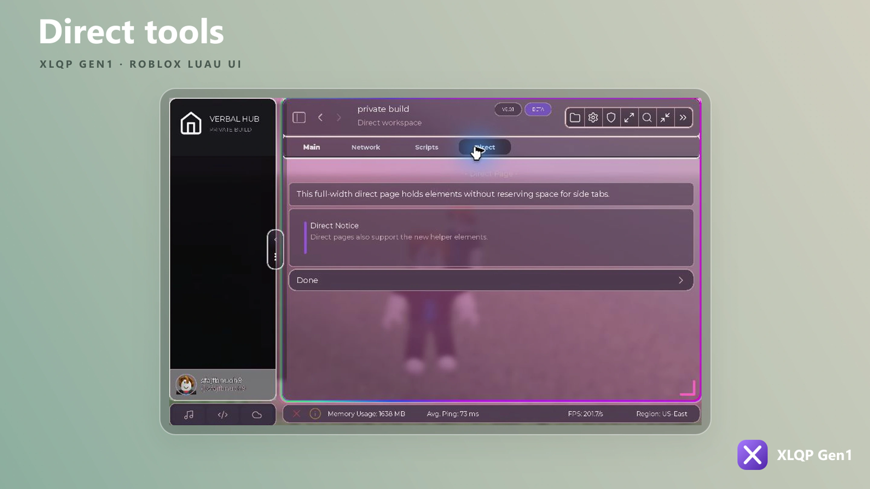
Window tabs
local Home = Window:MakeTab({
    Name = "Home",
    Icon = "home",
})

local Combat = Window:MakeTab({
    Name = "Combat",
    Icon = "swords",
})
The window controller also supports newmaketabtop when a project needs its alternate top-tab behavior.
Sections
local General = Home:AddSection({ Name = "General" })
local Status = Home:AddBoxSection({
    Name = "Status",
    Content = "Live session information",
    DefaultOpen = true,
})
AddBoxSection returns a controller with SetOpen, Toggle, and SetTitle.
Tab boxes
local Box = Home:AddTabbox({
    Name = "Profiles",
    TabSize = 120,
})

local LocalTab = Box:AddTab({ Name = "Local" })
local CloudTab = Box:AddTab({ Name = "Cloud" })
Use IconOnly = true on AddTabbox for a compact icon navigation treatment.
Sidebar menus
local Menu = Home:AddRightSidebarMenu({
    Name = "Details",
    Icon = "panel-right",
    Width = 360,
    Height = 480,
    MinWidth = 260,
    MaxWidth = 620,
    Resizable = true,
    Detached = false,
    DimBackground = true,
    CloseOnOutside = true,
})

Menu:Open()
Menu:Close()
Both AddLeftSidebarMenu and AddRightSidebarMenu accept Name, Icon, Width, Height, min/max dimensions, Resizable, Detached, Gap, DimBackground, and CloseOnOutside.
Dropdown panels
local Panel = Home:AddDropdownPanel({
    Name = "Quick settings",
    Title = "Quick settings",
    Open = false,
})

Panel:AddGroupbox({ Name = "General" })
Panel:SetOpen(true)
Panel controllers can SetOpen, Toggle, AddGroupbox, AddTabbox, change title/icon/size, pin, collapse, detach, and destroy the panel.
Collapsing the main sidebar
Window:SetSidebarCollapsed(true)Call it again with false to restore the expanded sidebar. The configured SidebarCollapsedWidth and SidebarWidth determine both sizes.